|
|
|
|
|
||||||||||||||||||||||||
| FAQ | Finance glossary | Basic statistics | Monte Carlo simulation | Risk & CAPM | Lease or buy |
| Tutorial: BASIC STATISTICS |
||
FinanceIsland's statistics tutorial
provides an overview of key statistics concepts, which are used
across some of our advanced analysis tools. The tutorial is divided
into six parts:
|
Some of the key statistics concepts - such as standard deviation and confidence interval - are being used in FinanceIsland's
ROI analysis tool.
|
|
Mean,
median, and mode
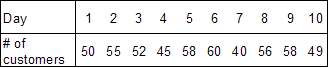
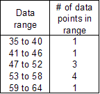
The most commonly used statistical metric is the mean, which is also referred to as the average. The mean is computed by adding together all data points and dividing by the number of data points. Given the example above, the mean would be (50+55+52+45+58+60+40+56+58+49=523) divided by 10, or 52.3 customers per day. This can be considered the number of customers to expect on a typical day. In this example, all of the data points are near the mean. However, what would happen if there were a few rogue data points that were very unusual, but not erroneous? Such data points are often referred to in statistics as outliers, and they can cause the mean to be of questionable value. For example, what if there were two more days during which there were no customers at all? In this case we would have the same total number of customers, but 12 data points, for an average of 43.6 (523 divided by 12) customers per day. If these two "bad" business days were just a fluke, then the 43.6 average of customers a day is probably not an adequate reflection of how many customers to expect on a typical day of business. In such a case, statisticians often turn to another measure known as the median. To find the median of a set of data points, we simply list them in order and take the value in the middle. If there is an even number of data elements, then there will be no single value in the middle, so we take the average of the middle two. In the previous example with two additional days without customers, the values listed in order are: 0, 0, 40, 45, 49, 50, 52, 55, 56, 58, 58, 60. The middle two numbers are 50 and 52, so the median is the average of these two numbers: 51 (50+52=102 divided by 2). Note that the median value of 51 is much closer to the original mean (before we added the two outlying zeroes to the data set). If we really believe that the two days of no customers are not representative of a typical 12-day span, then the median is a better indication of what to expect on a typical day of business than the mean. One final measure whose importance is less obvious is called the mode. The mode is simply the most common value in the data set. In the original data set above, all of the numbers occur once except for 58, which occurs twice. The mode of the original data set is therefore 58. In the case of a tie, there are multiple modes; so, in the expanded example where we added two days with no customers, there would be two modes: 0 and 58. Why would we ever care about the mode? Actually, the mode is not used very often because it tends to be very close to the mean. However, for some probability distributions you will encounter cases where the mode can be quite different from the mean. In such cases, the mode is a much easier parameter to visualize when trying to describe a probability distribution. Histograms Often it is important to understand the “spread” of your data, i.e., how much individual values tend to differ from the mean, median, and mode. The simplest way is to create a graphical interpretation known as a histogram. To generate a histogram, you divide the range of data points into several smaller ranges of equal size, which are sometimes referred to as bins. You then count the number of data points in each range or bin. For example, the table below indicates one possible choice of dividing up the range for the original data set above.
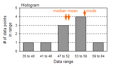
Graphically, a histogram is just a bar chart:
As you can see, the histogram quickly shows how spread out
the data is from the mean (52.3), median (51), and mode (58).
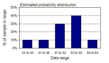
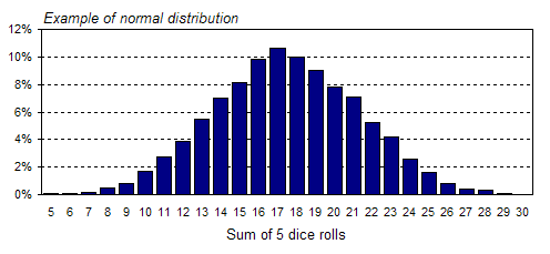
For example, the graph above indicates that on any given day there is a 40% chance that between 53 and 58 customers will visit the store. Now, this might be an unrealistic interpretation based on only 10 days worth of data, but what if you had data for a 10-year span? A 10-year sample might be a very good estimate of the population, in which case, this would be a perfectly valid way to interpret the graph. Graphs like the one above are referred to as probability distributions. This one is labeled an estimated probability distribution because it is based on such a small sample size (a probability distribution actually describes a population rather than a sample). Information about probability distributions is a key input to all of FinanceIsland's simulation tools, so let's examine them further. Probability distributions Graphically speaking, a probability distribution is just a histogram with percentages on the y-axis, rather than absolute numbers. Mathematically speaking, a probability distribution is a function that describes how likely it is that a measure (in the graph above, it was the number of customers to visit a store on any given business day) will take on a particular value. The probability distribution below is from a dice-rolling simulation in which 5 dice were rolled together 10,000 times.
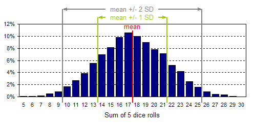
Why does the distribution look like this? It's a result of the number of different combinations of dice rolls that add to any given total. For example, there is only one way to get a total of 5 on five dice rolls: to roll 5 ones. This is not a very common occurrence. On the other hand, there are a lot of different ways to roll a total of 17, hence a far larger proportion of dice rolls lead to a total of 17 and the bar at 17 is much higher. The mean of this data set, which is a sample, happens to be 17.46. The theoretical population mean is exactly 17.5. In this case, the mean of the sample and the mean of the population are very close because of the large number of data points that were studied (10,000). The mode in our example is 17. You can find the mode of the sample just by looking at the probability distribution, as all possible values are listed on the x-axis. The tallest bar indicates the most common value, or by definition, the mode. That the mode is so close to the mean is expected, as this distribution is symmetrical, i.e., it's neither skewed to the right, nor to the left. In general, the population mean will equal the mode for a symmetrical distribution. Standard deviation Now that you know how to graphically determine the spread of your data, we'll show you why it's worthwhile to numerically measure the spread. The most common metric for measuring the spread is called the standard deviation, a central concept in statistics. Most spreadsheet software and math calculators contain functionality to calculate standard deviation. It's important to keep in mind that it's very difficult to interpret a standard deviation unless you know how your data is distributed. In the case of a normal distribution, roughly 69% of all the data lie between one standard deviation to the left of the mean and one standard deviation to the right of the mean. For example, the standard deviation of the data shown above (the 5 dice rolled) was calculated to be 3.83 and the mean was found to be 17.46. Since this is a normal distribution, 69% of the time the sum of the 5 dice rolls was between 17.46-3.83 and 17.46+3.83, or between 13.63 and 21.29. This really means between 14 and 21, as sums of dice rolls are always whole numbers. Another useful rule is that roughly 95% of all the data for a normal distribution lies within two standard deviations of the mean. In this example, that would correspond to values between 9.8 and 25.1, or between 10 and 25 as the sums of dice rolls must be whole numbers. Below is the normal distribution graph from above with lines inserted at various standard deviations (SD) from the mean.
The vertical lines in the chart above are referred to as confidence limits because they reflect how confident you can be that a random observation of your data (in this case, a roll of 5 dice) will lead to a value within certain bounds. The range between confidence limits is referred to as the confidence interval. The lines shown above define two-sided confidence intervals because they lie on either side of the mean. For example, the range of values between the gray lines, representing two standard deviations around the mean, is referred to as the 95% confidence interval. One-sided confidence intervals can also be defined. For example, the 95% one-sided confidence limit for a normal distribution lies 1.64 standard deviations from the mean. In the example above, the mean is 17.46 and the standard deviation is 3.83. This means that 95% of the area (or 95% of all the data) lies to the left of 17.46+1.64*3.83, or to the left of 24. Alternatively, you can say that 95% of all the data will be to the right of 17.46-1.64*3.83, or to the right of 11. Both one-sided confidence intervals are shown in the charts below. 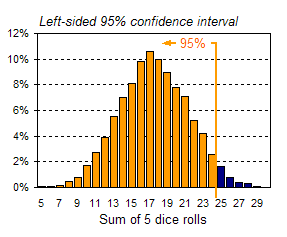 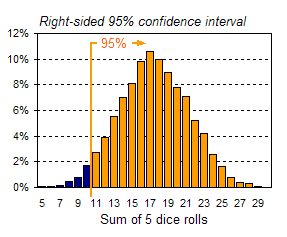 Summary This tutorial was a brief introduction to key statistics concepts applied in some of FinanceIsland's advanced tools. Although this statistics background is not required to use our tools, we hope you found this tutorial valuable. |
||